Showing posts with label 9th century manuscript. Show all posts

Sunday, January 7, 2018

Inspiration from the Bern Physiologus

Christmas time was a good excuse to do some painting, because I like to give friends gifts that I have made when I am able to make the time to do so. I have been gearing up to do some painting on a box that I am making, so a couple Christmas gifts were a good excuse to get in some practice in the art of painting without preparatory under-drawing.

I chose the Bern Physiologus, which is a 9th century rendition of a 5th century copy of a 3rd century manuscript, for my inspiration. This treaties was a precursor to the "bestiaries"  which had become very popular by the 11th century. They are a collection of writings on various animals and other creatures and were written with the intent of deriving a moral or Christological meaning  from the behaviour and characteristics of the named animals. The artist of the example found in the Bernbibliothek, must have had several different sources for his artwork, but the ones I liked best seem to be inspired by Roman wall fresco.

"The nature of animals at night"
in other words, owls. This work seems to channel the look of
Roman era wall murals such as those pictures below

A mosaic from Pompeii and a fresco from
Herculaneum exhibit the sort of artwork that the 9th
century artist had in mind when painting the
Bern Physiologus


In the world of decorative art, there is a very long tradition of decorating objects and walls with a very free and "unscripted" sort of painting. Most people are familiar with this sort of work in 19th century "folk" art furniture, but by that time, such work was already very ancient. I would venture a guess that as long as furniture has been decorated, this has been a way of ornamenting it. I do know that there is an example of this sort of painted decoration on a little book cover, also found in the Bernbibliothek, in Switzerland, which is from the beginning of the 11th century. I have reproduced a detail of it below, as well as a little painted panel that I saw in the Louvre, which was done in the 7th or 8th century.


Painted decoration on the inside of an 11th century wooden booklet cover
Bern, Switzerland

A very free and spontaneous bird catching a snake; fragment in the Louvre
To begin painting my panels, I first applied gesso as Theophilus directs, and then scraped it down with a cabinet scraper. I used a "silver point" which I made from a length of silver solder, to draw out the border. I do not believe that the 9th century artist drew in the trees or birds, so I did not either.


A blank white panel and the lines made with a silver stylus; you will have to
look carefully to see the lines that it makes because they are much lighter
than those made by a modern pencil


It is my intention to move into egg tempera painting, (something I have been wanting to do for a long time) but before I begin working with that medium I wanted to practice with something a little less expensive, (I spent over 300$ buying natural pigments for this purpose) so I opted to use milk paint. In all likelihood milk paint was also used in medieval times, along with glue based paint, gum (several varieties, including, according to Theophilus, gum derived from plum trees) and oils. Each type of medium has its own characteristics, but that exhibited by egg tempera was the medium preferred by most medieval artists.

The distinctive characteristic of milk paint is that it is rather "chalky", owing to its lime-based composition. This is great if you want to achieve the look of fresco, and that has been my main purpose in using it in the past. When it comes to applying a varnish or glaze to it, however, all sorts of weird things can happen.


A series of photos showing the progression of the work. Nothing is drawn in
beforehand, so this requires a clear concept of what you want to do before
beginning the work

Another thing that happens with this paint is that it is difficult to regulate lights and darks. When the dark colours are wet, they look dark enough, but when they dry, they become lighter. I am never sure what it will actually turn out like until I put on the varnish. If you compare the last two pictures, you will see that the dark border on the left side has turned light after it dried. Also, I had applied shadows to the trees, but they mostly vanished once the colour dried. In the same token, when I put on highlights, they were way too light and looked almost white, until I varnished the panel, and then the darks and lights came out (mostly) right again. This was definitely an experiment.


Grinding woad pigment with a muller


Another experiment that I did was adding some woad powder to my blue to make it darker. Woad was a European substitute for indigo and is a very dark blue. My blue that I had was not dark enough to make the border so I decided to use some of my newly acquired pigments to help it out. The stuff refused to dissolve in the water based paint so I had to add a lot of ammonia to it; it still did not dissolve completely, but I managed to get something that worked.


After varnish was applied


Above you can see the differences that the application of varnish had on the final results. My darks are dark again, and the highlights are not too white. The downside, however, was that the smokey haze look of the background was considerably lessened and the colour is not as pale as it was.

Once that one was finished, I did another one for another friend. 


Once I finished the first one I tried a second to see if I had learned anything


This one was based on two separate images from the Physiologus.


The two pictures which were merged to become my second one;
the original Oscar?


Very curiously, this guy is supposed to be a "salamander". In some versions of the text, it says "the lizard or salamander". incidentally, there is a lizard which looks like he could be the inspiration for this creature, but is supposedly only found in north America; I have no explanation.


Real-life horned lizard, but he comes from Texas!


I put these two panels against my box, imagining them as being painted on the box itself; the result could be quite pleasing but is not what I plan to use for its decoration. This was merely an exercise in learning to paint loosely.


The second picture was taken before the varnish. it has a very different look;
much more like a fresco


Sunday, December 10, 2017

9th Century Furniture Ornamentation

Several years ago I came across the website for the Bibliothèque nationale de France and discovered a vast online collection of manuscripts. I spent months going through nearly every available 8th through 12th century work looking for images related to my field of the study of furniture, interiors, and decorative objects. I found a wealth of information which both confirmed my suspicions of the complexity and variety of objects and designs from that period, as well as providing a few examples to prove that things I expected had existed, but had never seen any examples of, were in fact in existence .

A few weeks ago, I was looking for an image that I knew I had, but could not locate in my files. After awhile, I decided the fastest way to find what I was looking for would be to go back to the source and look it up again. A lot has changed since the first time I visited the site, and I was delighted to see that, for many manuscripts, the website has been updated so that one can "zoom in" to even larger formats than had previously been available. This was great because in some pictures, one can now see details that were previously invisible at the resolutions in which they used to be displayed. A good example would be the details now revealed in this scene of St Mathew from folio 17v ('v' is for "verso" which is Latin for the back side of a page, and where we get the words 'obverse' and 'reverse' from)


St Mathew, from BNF Abeville MS 4 fol 17v ca 790-800 AD

The above image is as detailed as one was previously able to view, You can see that there is a chair with its ever present foot bench, a lectern, and an ink stand, you can also deduct that the  stand is made of metal, and the lectern seems to be made of part metal and part other materials. The decorations of the chair appear to be some sort of gold strips. The fact that the picture was painted on very expensive purple dyed velum does not actually help us in discerning the details, because at this resolution, areas where the paint has flaked away makes it difficult to distinguish between scratches and deliberate decorations.


Scrolling vine and bead decorations revealed in high resolution; this is from
the middle section of the left side of the plinth chair, near the hem of
St Mathew's robe
Acanthus leaf and other details of decoration on the chair and the lectern

One cannot download images at these higher resolution, but it is great to be able to view small details at four or five times their actual size. This helps greatly in compensating for more than 1200 years of wear and tear to the pictures. At this resolution, one can see that the stripes on the chair are actually moulding, with dots and gold scrolling vine decorations. The top moulded edge of the chair has an acanthus leaf design to it, and the bosses, or knobs of the lectern have five white dots; a "shorthand" way to indicate that these junctions also have carving or some other type of ornamentation to them.

As I sat studying these details, it dawned on me the type of ornamentation the artist had in mind when he painted this picture. I realised with that information, and comparing it with surviving objects made with the same techniques I could go a lot further than one typically can in visualising the actual appearance of these objects.

It must be made clear that any sort of hypothetical recreation is exactly that, hypothetical. Any time one sees a reconstructed drawing or model of anything from a car accident, 2nd Dynasty Egyptian temple, or a "3D" image of a dinosaur, the artist can only do the best he can with his knowledge of the subject and the information he has to hand. I am therefore not going to attempt to make a chair and claim it to be what this illustration represents, but I do wish, in this post, to point out actual objects and design elements from the same era, which will help you to get a better idea of what such a chair may have looked like for yourself. I also want to stress that usually artists were not trying to represent any particular chair, but rather they were illustrating the general appearance of a particular chair type. I strive to bring to life, in your mind, the complexity and sophistication available in a time that was supposed to be "crude" and "dark", and help you see what might have been since it no longer exists.

In studying these high-resolution details, the first thing I realised was that this image of St Mathew's chair represents a metal foil covered chair. Metalworking was one of the favourite mediums of ornamentation for many early medieval craftsmen working in several divers types of craft. This was a carry-over from the Celtic and Migration Peoples who had exploited the medium to phenomenal degrees of design and quality. The museums are full of bits and bobbles of every description, demonstrating the skill that early medieval artists had with the manipulation of sheet-metal. Most of what survives, though, are small items. This medium was used for larger objects too; everything from altars, buckets and crosses, to doors and chairs, were covered with punched, embossed, and repoussé work.


Metal covering from a Migration Period Chest (6-7th century)


I believe the above picture is an object in the Cathedral Treasury (Schatzkammer) Musem in Köln, but cannot remember for sure. I do know that I saw it on my trip, but I do not have a picture of it; pictures were forbidden in that museum (they take your camera and lock it up until you leave), so this must have been the place where I saw it. The above picture is one that I found on the web six or seven years ago, with no information about it, and have never seen any other picture of it since then, but when I saw it myself, on my recent trip, I recognised it at once. Wherever it is, it shows a metal covering for a small chest of a form seen in many 8th and 9th century manuscripts, as well as several Roman era mosaics and wall paintings. Though the ornamental style is different from that of our chair, it is based on the same sort of decorative scheme (an ornamented metal foil covering). Most of this sort of work survives as book covers and on small reliquary caskets, but there are enough of those to show that this sort of work was quite common, and like every other art form, there was a vast range of quality of workmanship as well as degrees of ornamental sophistication employed in their creation.


9th century Gilt copper casket in the Diözesanmuseum Ellwangen
The fundamentals of this sort of furniture begin with a wooden core. In the case of this sort of plinth chair, that core would be a basic box with  mouldings either applied or carved out of the solid. One of the things that would have historians all abuzz over such a chair, were one to have actually survived, would be its method of joinery. Based on that, they would try to establish a date for the object, but in principle, a chair like this could have been made at any point throughout the Middle Ages, and the only thing that would give it stylistic changes, would be in the manner of the decoration on the foil.

As I said, metal foil ornamentation was a very popular method of ornamenting things from pre-Christian times, well into the 13th century. This was so much so that it influenced the style of carving in other mediums at the onset of the Middle Ages. People often compare the flat low relief carvings of the early medieval period with the very three dimensional work of the high Roman period and dismiss it as, "crude" "primitive" and "unskilled". Some of it certainly was less well-executed than others, but overall, if one thinks about it, it can clearly be seen that this was a deliberate choice of sculpting stone to look like metal. Just as artists of the 1920's made a deliberate shift in the carving style and created the Art déco style, a deliberate shift was made away from the classical Roman styles, to create a new style that more suited the tastes and culture of the people who were the new dominating force of Europe. In all likelihood, the stone panel pictured below, which was part of a chancel screen in an Italian church, was either gilded or painted gold, giving it almost exactly the same appearance as the  foil-work decorations that the metalworkers were producing at the time.


A carved stone panel in the Musei Civici di Pavia
In a ll probability, this panel was originally gilt, or gold painted
giving it almost exactly the same appearance as embossed foil work. 

Below are a couple details from some 8th and 9th century work. I chose these two pictures because they show scrolling decorations similar to what the artist of St Mathew's chair had in mind. The first also shows the very popular use of a beaded border, which is also represented in the manuscript illustration. The second piece is much less accomplished than the first, but no apology is needed for it, not every work produced in any time period is of the highest quality. One should also, when viewing such items, bear in mind that they have usually been taken apart and put back together over the years, due to damage or deterioration of the wooden core, and that any piece of metal which has been continuously handled for 1200+ years will have inevitably suffered from dents, scratches, and crushing.


An embossed silver border around an ivory panel;
part of a 9th century book cover, and a wing of an embossed
foil-covered cross of the 8th or 9th century.

One of the methods employed in this sort of decoration was the use of dies, or "matrices" used to create repetitive designs in the metal. The scrolling border design as well as the central branching elements to the arm of the cross pictured above were created with these sort of ready made stamping dies. The artist tried to get creative with the die he used  in the centre by adjusting the spacing and over-stamping successively in order to get the design to narrow as it went towards the centre of the arm. The simplified acanthus leaf decoration to the book cover moulding is also created with these sort of  dies. 

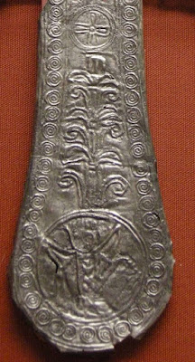
Below, is an illustration of a piece of cruciform gold foil which has stamped design work on its entire surface. There are many of these gold crosses found in museums all over the world, and seem to have been popular from the 4th century to the 9th. They were apparently made as offerings, to hang in churches, and to place with the dead, in tombs and cemeteries. Most of the examples we have were recovered from burial sights. I show this object to illustrate how important ornamentation was to people in the Middle Ages, for any sort of object. It seems that a plain, flat sheet of metal would not due, and so some sort of design was stamped onto them. The workmen producing them were not interested in creating a magnificent work of art, they were just suffering from the "horror Vacui" syndrome, which is a dislike of blank, flat, or empty space, and felt the need to decorate these objects in a thrifty way. Unlike modern taste, medieval people did not like blank empty flat  surfaces, and spaces, and therefore, they decorated everything. This cross was made almost willy-nilly by a single stamping to each of its arms with a die that was much larger than the arm. The result is that the centre of the cross is a jumble of over-stampings of incoherent design. As I said, the point was to decorate a basically disposable object, not to make a 'work of art'.


No two arms of this cross were stamped with the die in the same position,
the result is that we can see much more of the pattern than would have been
visible had it been carefully made.


Enough about stamping; on to scrolling vines.


A section of relief carving an the wall of  Santa Maria de Lara in Spain
8th century

Some Columns, now in the Cluny Museum, from
the 6-7th century Notre-Dame de la Daurade.
Compare the capitals with the lectern of St Mathew.


So far, we have looked at several metal objects, but none of them seem to have the same sort of vine decoration that is suggested in the illumination of St Mathew. I am sure there are examples that exist, but I like showing a variety of materials in these blogs, to illustrate how the same sort of ornament was used in various mediums. I believe the above two illustrations capture the essence of what the artist had in mind even if the material happens to be stone.

The top edge of the chair is painted with a red-orange colour as its base. This is different from the gold of the main body of the chair, but that does not necessarily indicate anything more than that the artist wanted to add another colour to his painting. It could also indicate a different material, or a different coloured metal, if the edge is also to be interpreted as being made of metal. If that is the case, then copper foil would be a good guess. (There are several examples of 11th and 12th century altars made of bi-coloured gold and copper-foil in the museums of northern Europe.) This change of colour could also indicate that the seat of the chair is made of carved and painted wood. This would make practical sense, as the nailed on foil decorations would probably not stand up very well on the edge of a seat and the nails would easily catch on clothing. However with no surviving examples of such a chair, the best we can do is speculate. 


A carved acanthus border of a 9th century ivory panel from a box., now
on display in the MET. (Originally the birds and flowers were gilded.)


Regardless of the material that it is made of, the artist has clearly indicted, as can be seen from the supper magnified image above, that he wanted his chair to have an acanthus leaf decoration to its upper and lower mouldings. Wooden 9th century acanthus leaf carving is hard to come by, but there are numerous examples carved in ivory, a much more durable material. 9th century art consisted in a large part, of a contrast and/or a mixing of Classical and Migration Period styles. The illustration of St Mathew holds firmly to the design elements of the classical tradition, as does the decoration of the above pictured box panel, and the following picture, which is a detail of a comb from the 2nd half of the 9th century.


Detail from the so-called St Heriburt Comb, Cluny


We have mostly been focusing on the chair, but I did mention the similarity between the carved capitals pictured above, and the one illustrated as the support for the lectern. I also mentioned at the beginning that the little white dots represent ornamentation to the bosses, or "knobs" of the lectern. At the scale of the painting, it would have been nearly impossible, as well as completely pointless, for the artist to have painted more detail, he was not trying to give a photo-realistic representation of a chair and lectern. Perhaps something like the cup boss pictured below, could be what the artist envisioned in his painting.


The boss of a chalice, from one of the Attarouthi Treasure objects; these
were displayed at an exhibition at the MET


There is no way we can ever really know how plinth chairs of the 9th century looked, because there are none which have survived. Even if one or two had, the vast variety of ornament which was employed over the entire continent doubtless rendered tens if not hundreds of thousands of chairs, each one different to the next, but at the same time, all conforming to contemporary stylistic trends and regional variations. We can speculate endlessly on how any one of them might have looked, but careful examination of other objects produced at the same time will give us a much better starting point for that speculation.


Videre Scire

Sunday, November 26, 2017

The Utrecht Psalter; Part VI

It has been awhile since we had a visit with the Utrecht Psalter, so I thought it was about time for the next installment in this series. This week's post brings us to the letter 'R' which is for Round Table. I did not do 'T' for table, because there are two types of tables and I wanted to cover each one of them separately.


Round Table from the 9th century Utrecht Psalter


I have counted 22 individual round tables in this Psalter, and they can be subdivided into three subcategories. The first are three tables which have been depicted with no visible legs of any sort. When this practice first began is not known to me, but there is a 3rd century BC painted Greek vase in the MET which has a scene with a table completely covered in a white cloth, leaving no visible legs to support it. This became an exasperating (for someone interested in furniture design history) trend in the 11th and 12th centuries, to the point that it is hard to find any depictions of tables from that era actually illustrating the legs. They are almost always shown as a top with an elaborately draped covering cloth, seemingly floating in space, as if by magic. (This is simply another example of trends in illustrated fashion, much like the overly elongated legs of female models in fashion illustrations of the mid 20th century, meant to exemplify an illusionary ideal.)


This represents a round table, but there are no details, to indicate anything
about construction details or ornamental decoration.
A round top table, again with no support depicted, but showing the fashion
for covering the table with an elaborate drapery.
This illustration comes from a 9th century book cover in the BNF.


Coming back to our 9th century Psalter, it is interesting to note that none of these tables are shown with a cloth covering. This should not be interpreted to mean that people did not cover their tables with cloths at this time, several 9th century ivory carvings show tables draped with cloth, completely obscuring the details of construction, just as with the 11th and 12th century trend that I mentioned. (see above) There was a lot of regional and artistic variation, and anything one sees in medieval illustrations should not necessarily be applied to the whole of Europe. In fact there is so little left to study, from the first two thirds of the Middle Ages, that any glimpses we see are like trying to watch a football match standing 2 metres behind a picket fence. Those glimpses, however, are enough to wet the apatite, and give people such as myself, reason to try to keep watching in hopes of seeing something fascinating.

There still exists one other very well illustrated 9th century Psalter, known as the Stuttgart Psalter, which could not be more different from the Utrecht Psalter. None of its illustration bear any resemblance to either the images used, or the driving concepts behind their inclusion in the manuscript. This shows us the wide range of style, and the variation which existed throughout Europe during the 9th century. (and nothing changed, on that note, for the rest of the medieval period) Of interest, insofar as this discussion is concerned, on that point, is the fact that whilst the Utrecht Psalter has no fewer than 29 tables depicted, (among more than 200 illustrations) the Stuttgart Psalter only has one, from more than 300 illustrations.

From our manuscript we find that the second sub-type of round table depicted is one with straight legs; there is only one such example of this type however. Since these illustrations are merely sketches, with almost no details, it is impossible to say whether the artist was intending square or turned legs, but they do seem to have a bit of taper to them. The truly unusual detail, however, is that unlike all of the other round tables depicted with legs, this one has four legs, whereas the others all have three. Given the level of detail in this manuscript, this table is no different from a dining table that might have been made in the 17th 18th or 19th century. There are a scattering of other medieval illustrations of round, four legged tables from the various centuries, and we can probably safely conclude that such tables existed, in the guise of the ever changing period decorations, right through the medieval period.


A four legged round top table. Would these legs be turned? It is hard to say.
This illustration does seem to suggest that the legs are applied to the outside
perimeter of the top (as apposed to being mounted underneath)


The third, and by far most common form of round table depicted in this Psalter, is a type carried over from Greco-roman times; this is a tripod table with lion mask and paw feet. There are 18 such tables in this manuscript, which probably doubles the number of extant illustrated examples from the whole of the 9th century. One example was given at the top of this article and another is pictured below. Both are of the same type, but this second illustration suggests that such tables could be made quite large to allow many guests to be seated, calling to mind the Arthurian legend of the "Knights of the Round Table".


A round tripod table large enough to seat many people, yet still made in
the same style as the smaller ones.

Anyone paying attention will note that all three legs seem to be on the same side, but this is a stylistic representation, and has a tradition probably as old as the actual design of this type of table, a point illustrated by the following 5th century BC Etruscan representation of one of these tables.


When I was in MET I spent time searching for origins of medieval furniture
design, this 5th century BC Etruscan table tells us that when the 9th century
Utrecht Psalter was illustrated, this table design had already been around for
more than 1300 years.


When one speaks of "the Middle Ages" most people will conjure up some mental image of what that means to them; inevitably, this image will have much more of a resemblance to life in the 13th, 14th or 15th centuries, than to earlier periods. The fact is, that styles and tastes evolved over the course of history, and by the time the 13th century came around, there was very little which resembled life of the 8th or 9th centuries, much as 1970 had very little to do with 1920. In a broader sense, the "medieval" world of the 9th century bore much more of a resemblance to the Roman period (at least in regions once included in the Roman Empire) than it did to the "Middle Ages" of the 14th century. The following six illustrations will quickly point this out.


Roman town, from a Pompeian Mural in the MET 

9th century depiction of a town, from an ivory panel in the V&A

Roman Soldiers from Trajan's Column

9th Century mounted soldiers from a mid 9th century Psalter,
St Gall, Switzerland
The helmets are still very much the same, as is the length and form of
the clothing, one change which has occurred is the more prevalent use of
chain mail armour.  

Another of the 18 round tables from the Utrecht Psalter. This one is of a
smaller personal size, such as the following charred remnant found in
Herculaneum, buried in the 79 AD eruption of Mt Vesuvius
A very rare survivor (almost a survivor) this is the charred remains of a
Roman era table, very much like those illustrated in the
Utrecht Psalter


I have read so many references to medieval tables being "planks set on top" of "crude" trestles, or "tree trunks" that it makes me want to scream. The medieval artwork tells a very different tale to that notion. It is also interesting to note that the earliest example I have found to date, of a "trestle table" is from the 13th century. This is not to say that they did not exist before that time, but most pre 13th century depictions of tables are round, demilune, or rectangular on turned or square legs, with an occasional 'X' frame or pedestal base to round out the selection. Most early illustrations of tables clearly indicate some form of decoration to the supporting members, wherever any support is actually indicated.

In centres of commerce and industry and places of education, where society continued to thrive, the Roman style of art melted away much more slowly. In Aachen, the capitol of the Carolingian realm, we find a pair of lion masks on the cathedral doors (I believe these are actually cast copies made from the originals) which were made in the 9th century, Here we still see a lot of classical influence on the design, including the panel construction of the doors, the egg and dart moulding, the acanthus leaf wreaths, and the lion faces, (they originally held rings, used to pull the doors closed), but we can also see that the changes of artistic trends have left their own period stamp on them.


One could easily imagine these lion's faces carved on the terminals of
lion-paw legs and then we would have a 9th century version of
this sort of table
A 1st Century AD table from Pompeii, This is another example
of a Roman table, but in principle it is much the same as those
illustrated in the manuscript. To get a 9th century version, we
need to add 9th century style lions, such as those pictured
in the previous illustration


To sum things up, there is so little of anything left from the early medieval period that it is impossible to recreate that world, but little hints and fragments, and a bit of logical deductive reasoning can fill in a bit more of the void left by the destruction of so much of what once was. This Utrecht Psalter gives us some tantalising glimpses, and informs us that certain stylistic trends, such as lion shaped tripod tables were very slow in dying out and continued into the 9th century


Last minute addition, just in case someone gets the idea that the tables
depicted in the Utrecht Psalter are an anomaly. This is from a manuscript
known as the Drogo Sacramentary, which is found in the BNF and was
created in the middle of the 9th century.
(BNF Lat. 9428)
.


Videre Scire


Sunday, October 1, 2017

Through the Eyes of a Medieval Artist

Some readers may recall the post I did on the end-panels of my 9th century box of about a year ago (plus a little). After I made them, I got the bright (or not) idea to make a mould from them so that I could cast plaster copies to sell at my shows. (Almost no one looked at them and no one bought any). I was intending to make 50 of each one, but only wound up making four of each. I am intending to give one to a fellow medieval enthusiast as a gift, but got another bright idea right before shipping it off.


The process began with a gilded plaster copy 


The idea was to decorate it with gold and paint to give the look of something that would combine medieval enamel work with illuminated book letters, which were often painted to look like enamel work. The purpose of this exercise is to show how bright and decorative medieval societies liked to have their possessions.

This blog shows the results, and a few pictures documenting the train of thought which transported me to this particular station.


The original carved wooden panel (not quite finished in this picture)

After gilding, I began mixing oil colours to give the look of enamel. The idea is that the light is able to penetrate the transparent medium and reflect off of the gold behind, just as with the glass which makes up enamel in the real pieces. Not all colours were transparent, however, so my white and yellow were mixed opaquely. It is not known how long the practice has continued, but since at least the 10th century people have been covering bright metal with pigments in oil, to give it a different colour. Theophilus mentions using saffron yellow to make tin look like gold, for example.


A beginning; to see how it would look. I liked it, but the colour is too thin and
looks like 15th century enamel, not 9th.


I chose the colour scheme from a late 9th century manuscript that I have been studying. Some version of nearly every colour was available in the middle ages, but not all colours were always used, or available to a given artist in a particular place at a specific period of time in history. Furthermore, a yellow which could have been available as a paint for a book may not have been available as a glass powder for making enamel, or vice versa. Even though I chose the colour scheme (two different greens, violet, white, yellow, and "red") from this manuscript, I consulted my files of  early medieval enamel work for the actual glass colours used.


Two colours of green, (most of the darker one has faded but you can still
see some of it in the segments of the letter) violet, white, red, and yellow.
The yellow has faded to almost white, except for in the top right-hand corner.
perhaps a different pigment was used in this spot? This letter (part of a 'B'
was painted to look like the enamel work of its day.
(from St Gall Library, Cod. Sang. 22, ca 880-900)


Not all colours, as they were originally used, had the same appearance as they do now. Reds and yellows were especially susceptible to fading, but depending on the pigment or dye used, any colour could fade or have a chemical reaction of one sort or another which might completely alter its original appearance. (for example, silver gilding in books has almost always turned black) Sometimes, however, artists were able to get good quality materials that have stood up very well to the ravages of time, allowing us to glimpse things as they were at the time of the artists' creation.


This manuscript still retains its vivid reds, blues and yellows.
A manuscript now in the J. Paul Getty Museum, orignally
created in Montecassino, Italy in 1153.
This is an example of a manuscript illumination imitating
contemporary enamel work as well. 


On my recent European trip, I visited the Minden Cathedral Treasury, in Germany, and took this photo of an early 11th century reliquary which has a 9th century enamel medallion in its centre front panel. The entire object is quite small and the lighting in the room made it difficult to get a good clean photo. I had to rely on a picture from a book for a close up detail of the enamel.


This enamel plaque has the dark green (not clearly discernible) red, yellow,
 white and violet (though it looks sort of
blackish in this picture) but not the light green.


I was able to get one close-up picture of this medallion which clearly shows the colours, but unfortunately, it is blurred, so that is about all one can see. (I have no idea why I did not take more than one close-up, to guard against that problem as I usually do.) Below is another object, (also taken from a picture in a book) of another enameled object showing more variety within the same basic colour group. This object is on display in the Vatican.


Multi-coloured enamel and gold reliquary box,
here one clearly sees the bright opaque yellow

This was the sort of look I wanted to give to my panel, and I believe it is very much in keeping with the manner in which it might have been ornamented in the 9th century. For the most part, modern taste would prefer the undecorated version, but a medieval artist would have seen it as unfinished business.


The finished piece, now I have no more excuses for not posting it off
There is silver leaf on the bosses of the vines.
Johann International Monogram used to sign all original creations

Do not ask how many hours it took to get to this point because I do not know, nor would I tell if I did.